HBM Machines
A month of deals across a vast range of professional tools. Three markets at once. Hundreds of assets. One identity that had to hold.
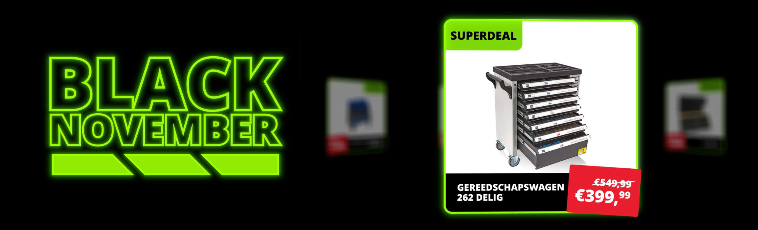
A month of deals across a vast range of professional tools. Dutch, French and German markets simultaneously. Hundreds of assets. Every day something new in market. That is the brief.
The question is how you build something that holds together at that volume without losing its character on day 23.
The answer was in the logo. HBM makes power tools. The battery bar is something every professional who uses their tools daily understands immediately. We built a charge mechanic into the logo mark inspired by exactly that, a small detail that did a lot of work. Energy, capacity, charge. Everything Black November needed to feel like.
From there the system was motion-first. Static assets exist but the campaign lives in animation. Products in context, deals arriving with urgency, the range communicated at a glance.
Each language version adapted to its audience while staying visually identical to the others. The scalable system was the real deliverable. Not just the November campaign but a framework HBM can return to. The identity does not need to be rebuilt each year. It needs to be recharged.
Hundreds of assets. One identity.
Black November in motion — the campaign across NL, FR and DE.